#8 Epic Fails
October 18, 2020
There are many and various reasons why a brand decides to redesign its touchpoints (visual id, packaging, shops, etc.). The common goal is to evolve, to enhance the brand image, the consumer experience, etc.
Usually, the processes are successful, but sometimes they are just a harsh reminder that agencies do not work for their clients (Companies) but for their clients' clients (consumers).
When we stop thinking about the customers, the design fails.
We want to share with you some dramatic, iconic, and fun examples.
Tropicana: The People Have Spoken
Even if you have never bought Tropicana or you live in a country where it's not distributed, you will surely have the packaging in mind.
What you have probably never seen is the 2009 redesign of the Arnell agency, since it lasted less than a month in stores.
The marketing investment was USD35 million, and in just a few weeks, they lost USD20 million in sales.
What happened? Why is it considered one of the biggest failures of modern design?
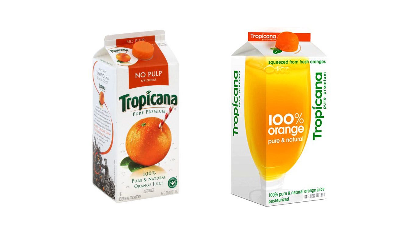
Simply because they went from this (left) to this (right):
Are powerful, well-established, and beloved brands like Tropicana the ones that can afford to take risks? Many times we think they have plenty of room for error.
The best-selling juice in the US ($700 million per year) didn't wait to reverse the situation.
Beyond the questionable decisions regarding its redesign, people did not recognize the new packaging in-store, and sales dropped by 20% (much more than expected when there is a change of packaging for a massive product).
“We thought it would be important to take this brand and bring it or evolve it into a more current or modern state.” stated Peter Arnell, director of the creative agency Arnell
Let's examine it point by point:
A glass of orange juice replaced the orange with a straw. This was probably the most notorious and significant change. Why replace the orange for a glass of juice, implying (or confusing) that it can be a blend, concentrated, or any other type of juice?
One of Tropicana's great features is its NATURAL juice. One orange says it all, we need nothing else.
The logo changed the font, visual weight, and location, and in the new version is ... vertical ....¿?
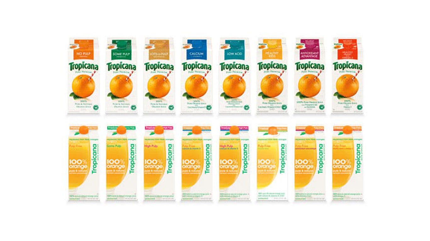
The "Pure Premium" line has like 12 different variations (with pulp, without pulp, with a lot of pulp, with a little bit of pulp but not as much as the other, and so on).
This item is key if we look and think about the packaging design from the consumer's perspective. In a matter of seconds, in a supermarket, while having to buy 25 other things, he/she has to grab the juice he/she likes to drink every morning, from a shelf full of eye-catching products.
In the original version, this feature is a big colored box, which very clearly says "NO PULP". Where is it in the new packaging? In a colored text inside the glass of juice...
The design has to SOLVE, simplify and speed up the process of selling a product. If this fails, no marketing campaign will help. The project will simply be a failure.
Gap: Worst rebranding in history (?)
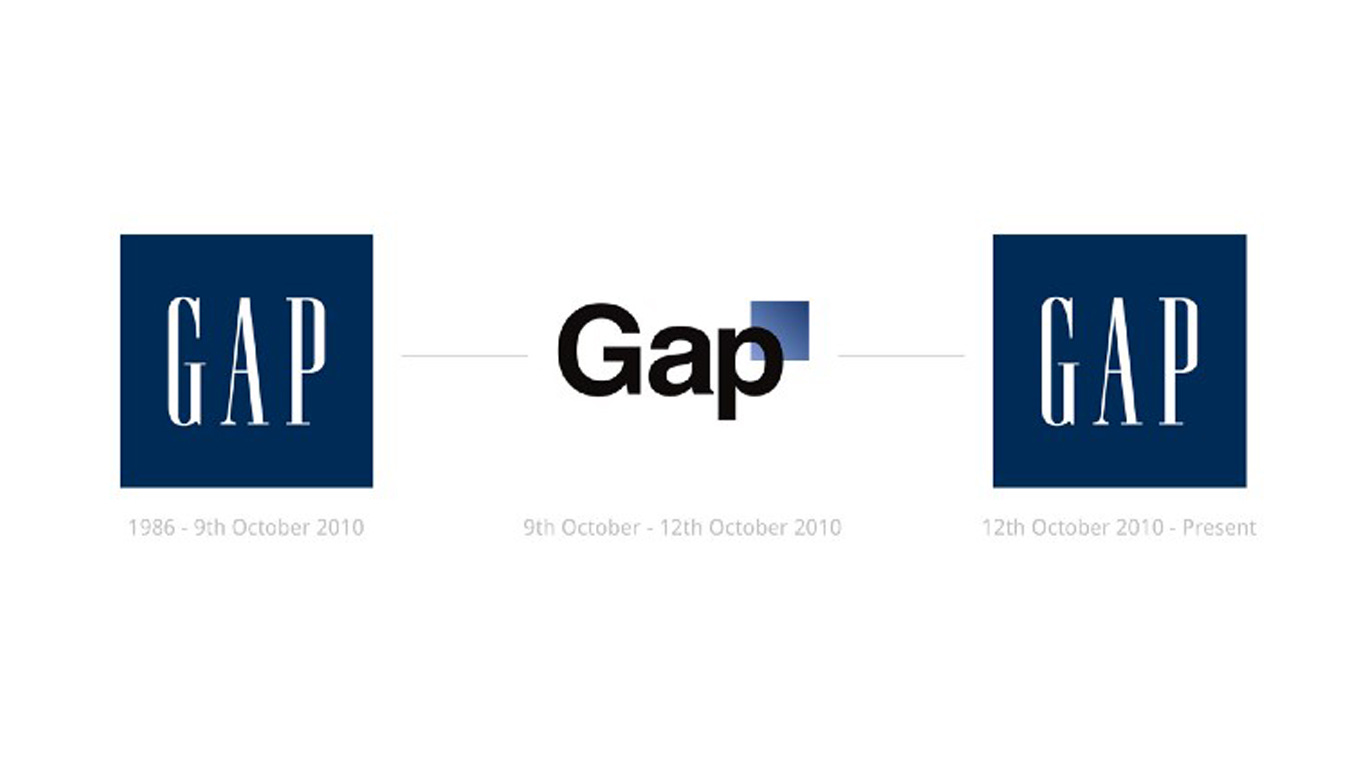
One of the cases with the greatest exposure and repercussions in branding's history. Gap's new visual identity lasted 6 days. In less than one week this happened:
In an attempt to get out of its comfort zone (24 years with the same identity), Gap decided to innovate and failed dramatically. Social media and the press were flooded with criticism for the clothing mogul, another proof that analysis and strategy are needed even though being a huge brand, in fact even more so.
However the addition of the blue square seems to be hated on a united front - it just looks cheap, tacky and very dull.
6 days after the launch of the rebranding, they backtracked, 4 months later the CEO left the company.
Conspiracy fans talked about how this move was planned to take the spotlight, get free advertising, and massive approval for the previous logo (which is now the current one). Therefore happier customers and audience. The theory is based on the rapid response to such a negative reaction.
In the end, there is a lot of reference to the arrogance of a label like Gap, which thought people would accept anything. They didn't rely on a proper rebranding process of a beloved and valued brand, they didn't listen.
"We've learned a lot in this process. And we are clear that we did not go about this in the right way. We recognise that we missed the opportunity to engage with the online community".
No Colors!
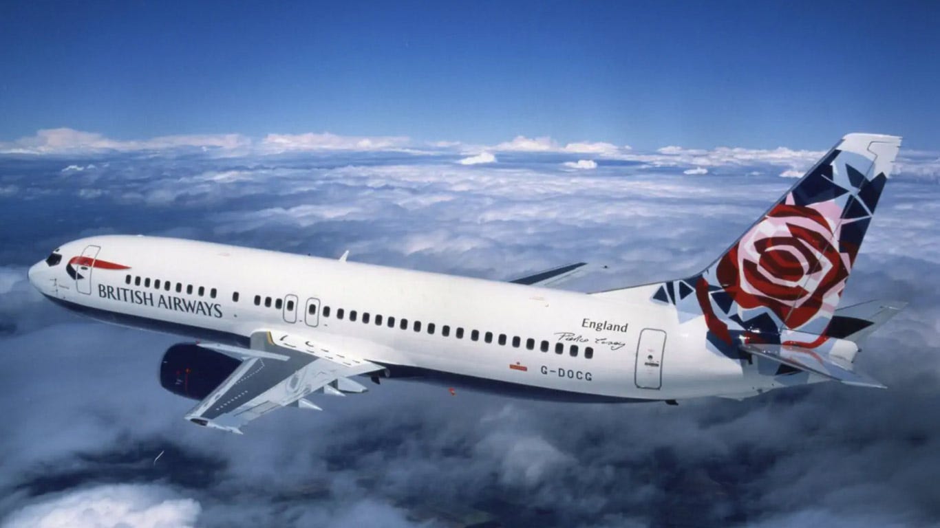
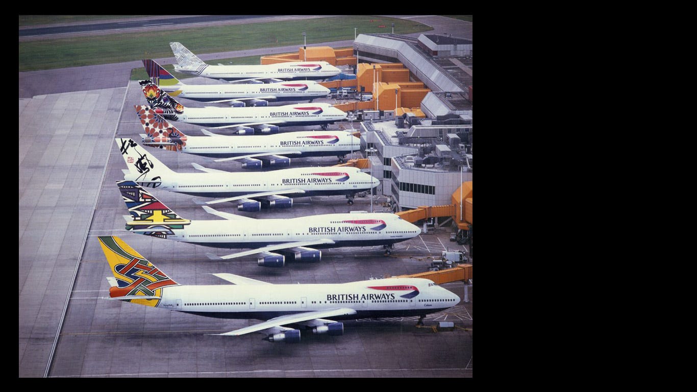
In 1997, British Airways decided to include a new design for the tail of their airplanes 50 images depicting ethnic groups around the world, replacing the well-known flag designed by Landor Associates in 1984. It was called Project Utopia.
The intention was to represent English values, with the most modern national attributes and a friendly, diverse, cosmopolitan, colorful, and open to all cultures.
Margaret Thatcher's (Prime Minister) reaction:
"We fly the British flag, not these awful things,"
Okay, Madam, we heard you.


Thanks for reading!
See you next time
Juan & Martina


