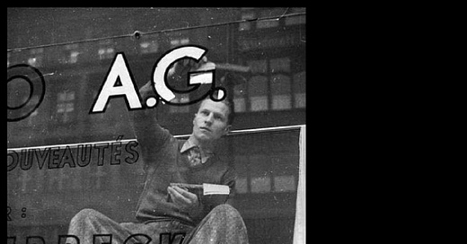
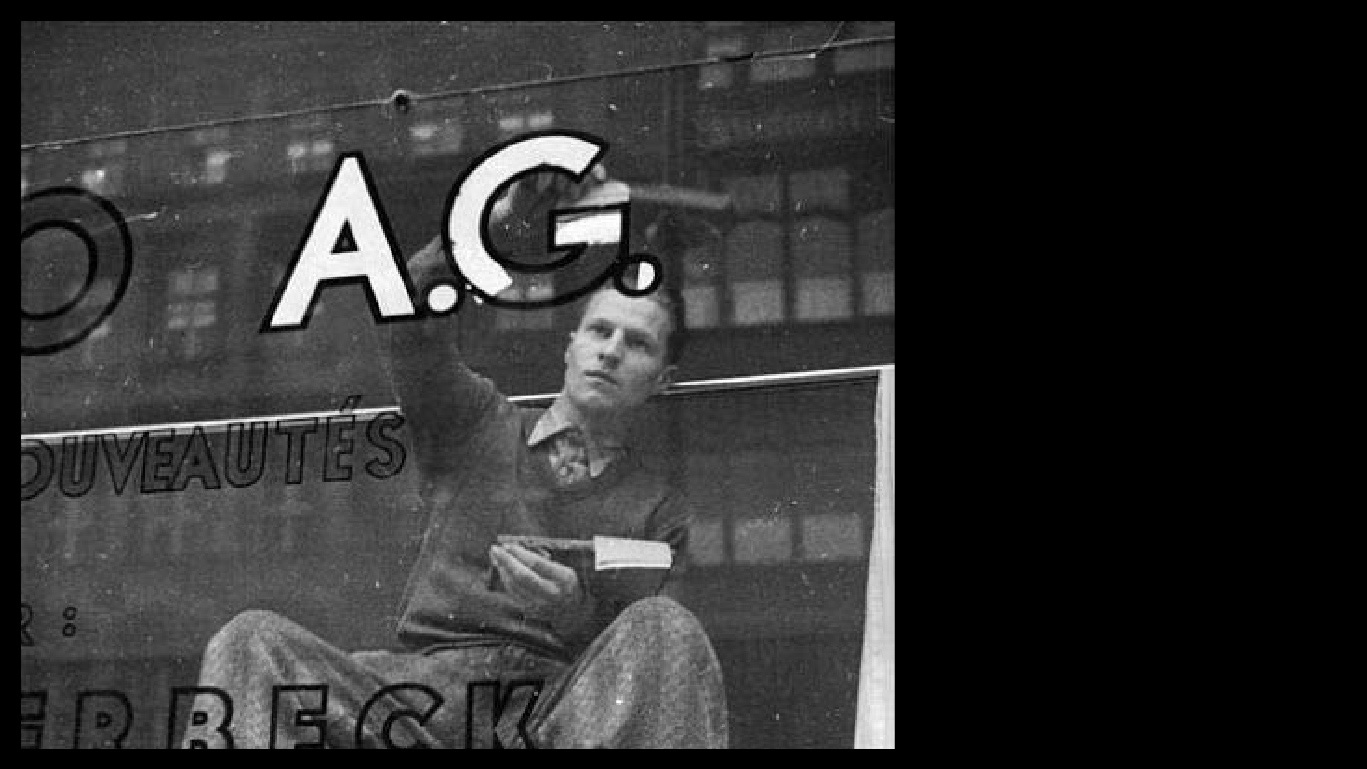
Illustrating typography/lettering is the most specific and simple definition. Originally, the letterer hand-painted the LOPEZ E HIJOS logo on the sign. Today they still draw letters, but they changed the Lopez's billboard for social networks, a startup's mural in Brooklyn, Berlin, a venue in Palermo, or an Indie music festival's identity.
The activity of drawing unique letters is at its best moment.
A return to expression, authentic or gestural. To the unique and non-repeatable (although we can repeat it millions of times thanks to digitalization).
New artists and designers all over the world are creating their artwork in campaigns, books, art, identities, logos, graphics, magazines, albums, and even giving classes, online courses in Skillshare and Domestika, designing their own tools and the community is growing more and more.
Yani & Guille. You've seen them.
If you live in Buenos Aires, you've probably come across their work.
Yani Arabena and Guille Vizzari are graphic designers specializing in typographic design, lettering, calligraphy, and illustration. They are perfectionists, very aesthetic, very talented, with a great mastery of typography, calligraphy, and typographic composition. Undoubtedly their work is one of the most important in this community.
You can check their work on their website and Instagram. Enjoy!
Hallo Martina, wie geht es dir?
They say there is a talented Argentinean everywhere in the world. Let's cross Berlin off the map, Martina Flor takes that place. She leads one of the most important design studios specializing in Lettering in the world. Some of her clients: The Washington Post, Vanity Fair, HarperCollins, Monotype, Etsy, Adobe, Mercedes Benz, and Lufthansa, not too bad.
Drawing letters is an incredibly slow-moving job. This is one of the first things I realized when I started working with lettering full-time. Since I used to run a one-woman studio and wanted to make a living from it, I had to come up with a workflow that would allow me to do multiple projects while responding to the working rhythm of agencies and publishing houses (where projects are due yesterday).
She also writes books about life and freelance work, and lettering and has been teaching courses, workshops, and online and face-to-face seminars for 10 years. The goal: is to educate designers, artists, and creators to use lettering as a creative playground.
Finally, the GOAT
Jessica is the best.
From a very young age, she participated in great projects and undoubtedly collaborated in the lettering phenomenon expansion. She is not just a great designer with a very keen aesthetic sense, she is also a brilliant creative.
A good example of her mindset is one of her first projects: Daily Drop Cap. This project was the solution to her concern: I need to find freelance clients and keep myself inspired: Since September 2009 and for two years, EVERY DAY an illustrated capital letter was posted, with the aim of " embellishing the internet" because they are free to use for blogs, and non-commercial sites.
A total of 12 complete alphabets were published. An absolute boss!
Books like In Progress, even collaborations with Wes Anderson, obviously great murals, and working for spectacular brands are other examples of her persistence and how she remains relevant in the market after 15 years of success. Everything she does is always impressive.
To know her a little better you can listen to an interview podcast. Creative Pep Talk with Andy J. Pizza
Also:
Lettering Tutorial and Design Influences.
"When I’m not drafting letterforms, manipulating beziers, writing kids books, or letter-pressing on my Vandercook, I’m doing my best to help others find the same happiness and fulfilment that I’ve found in my work."
Thanks for reading!
See you next time
Juan & Martina


