
#15 Across all touchpoints
Consistency is key

Hierarchy and Rhythm
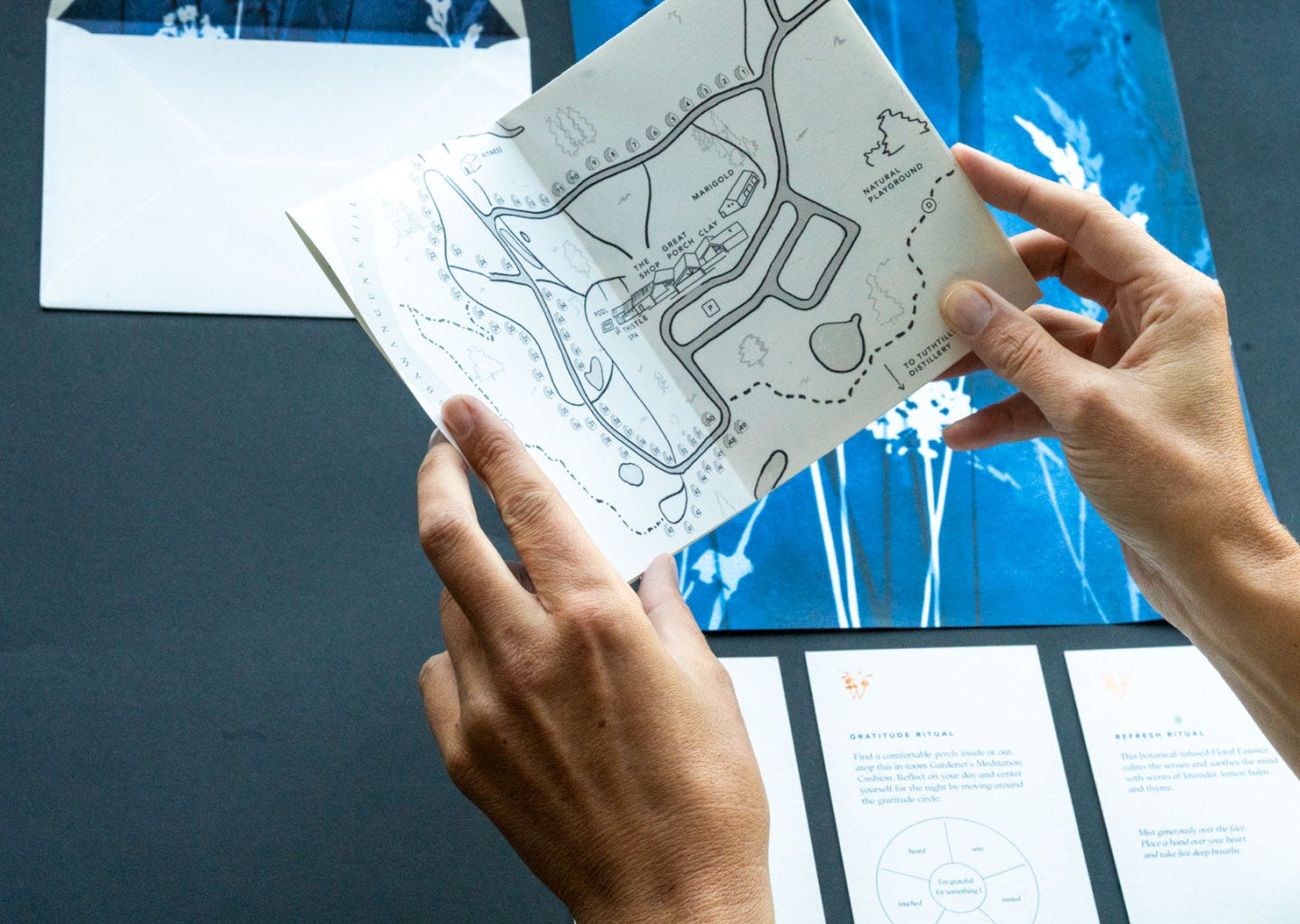
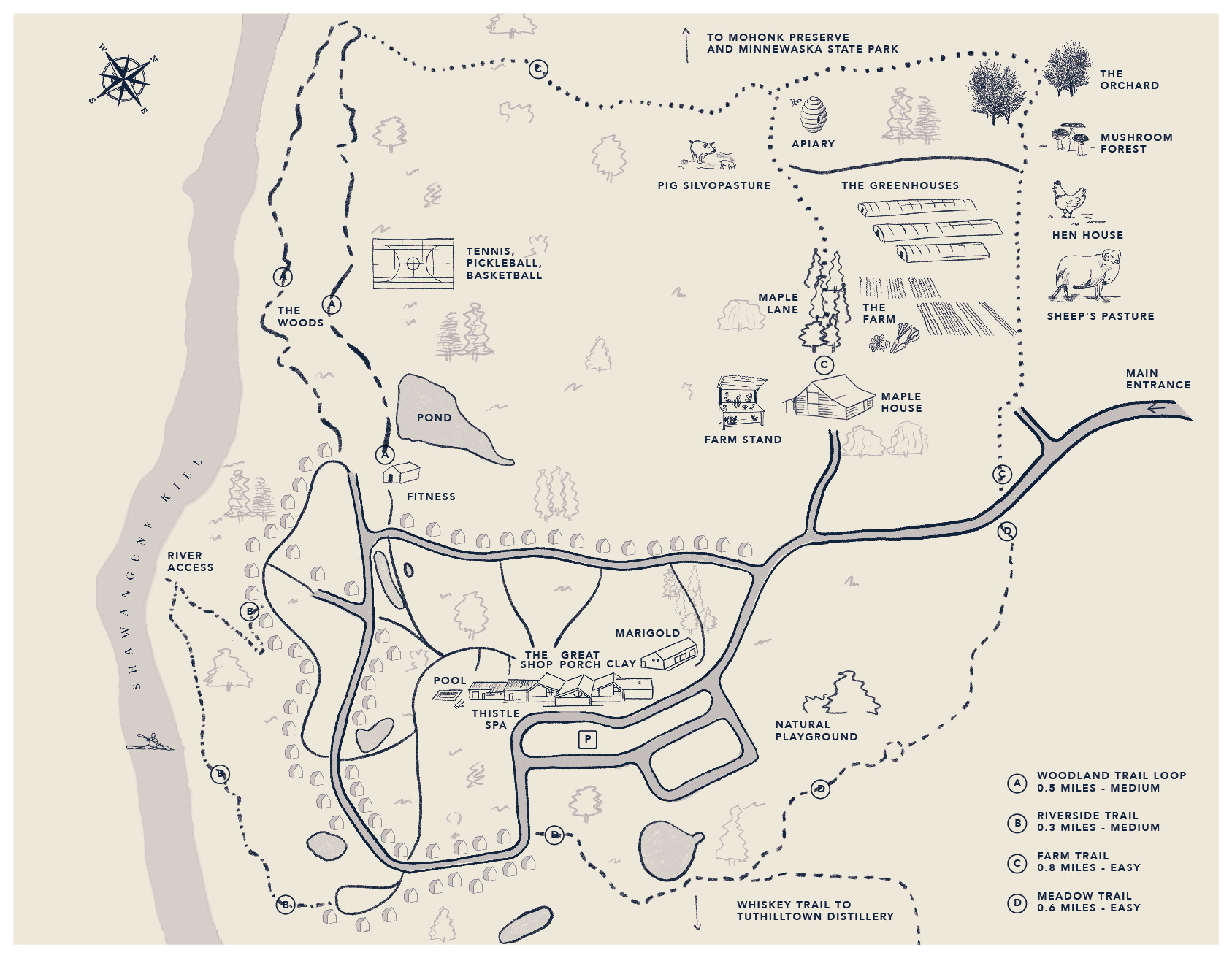
The hotel industry is characterized, for us designers, by having many touchpoints. Each one of these must be treated individually, and we must focus on their design, their text, and their materials, but at the same time, they must be analyzed in context. When are they delivered to the guest? Does that piece stay in the room, in the lobby? And at the same time, what other elements does it coexist with? We don't want the design to be repetitive, always looking the same and boring. The goal is for it to be read and felt as part of a system, a family without causing exhaustion. We must be subtle yet consistent, we must design a hierarchy and achieve rhythm, that is the challenge.
Concept.
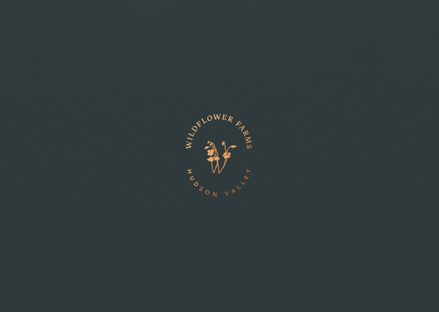
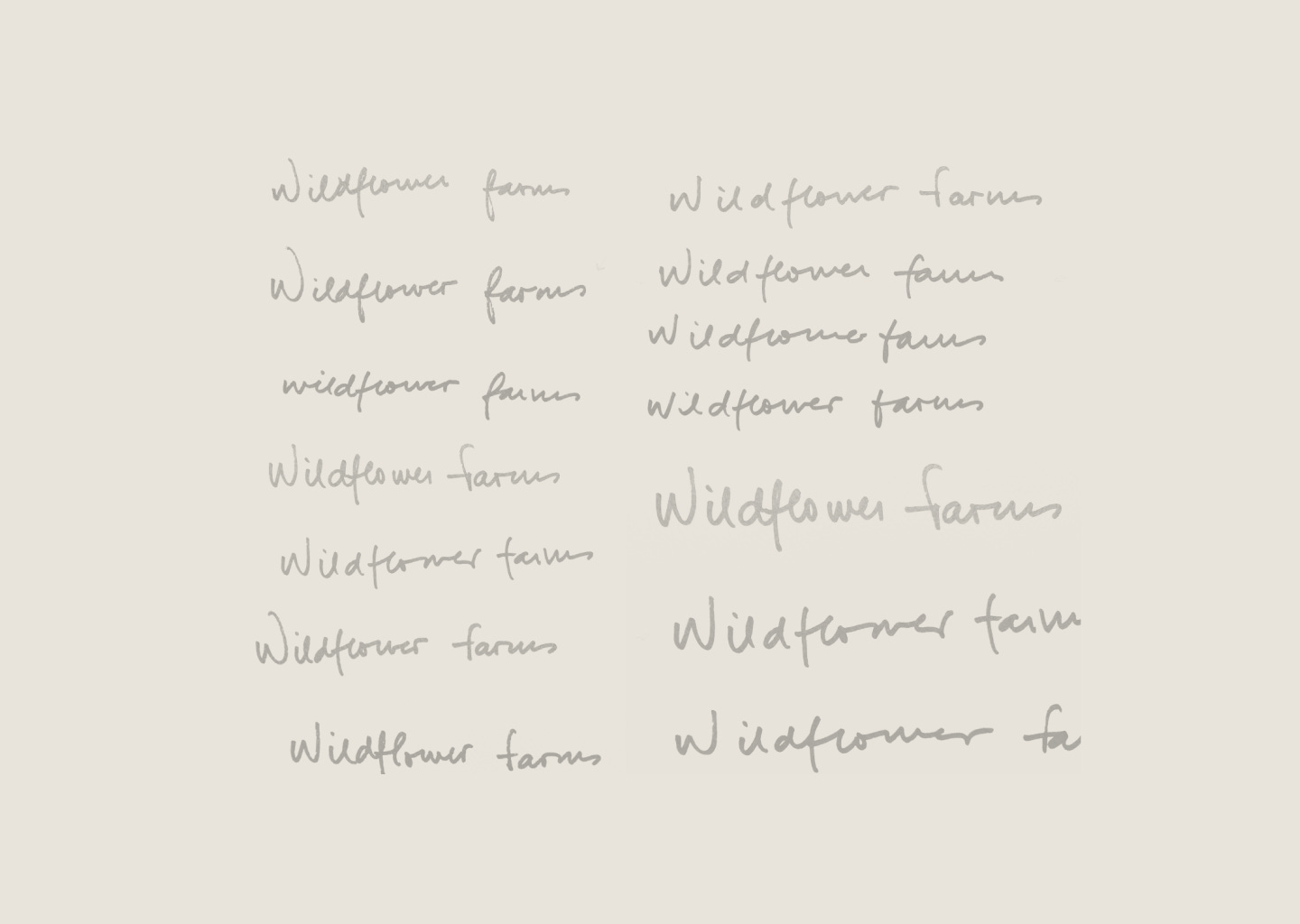
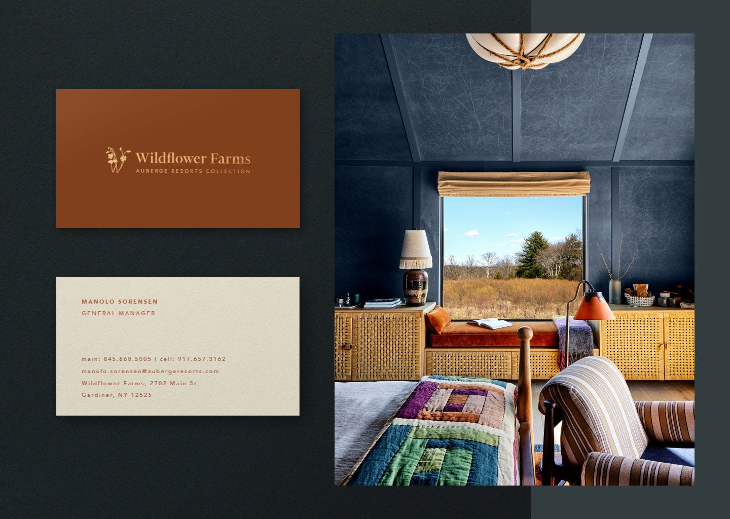
It is not common to come across clients who have such a clear core concept as Wildflower Farms. In this case, the strategy was perfectly outlined, and while it's not something we can boast about, it is something we enjoy. Knowing exactly who we are speaking to and how we will do it is a true guiding light, and all the pieces and communications easily align behind it.
The project within the project.
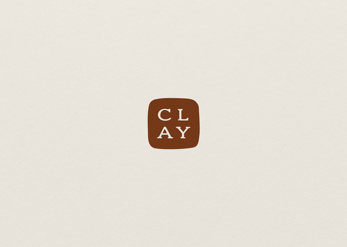
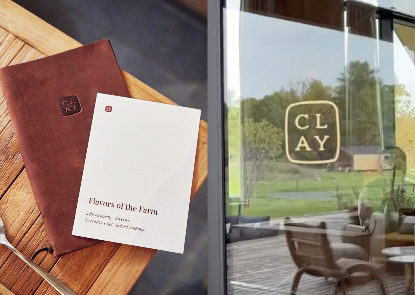
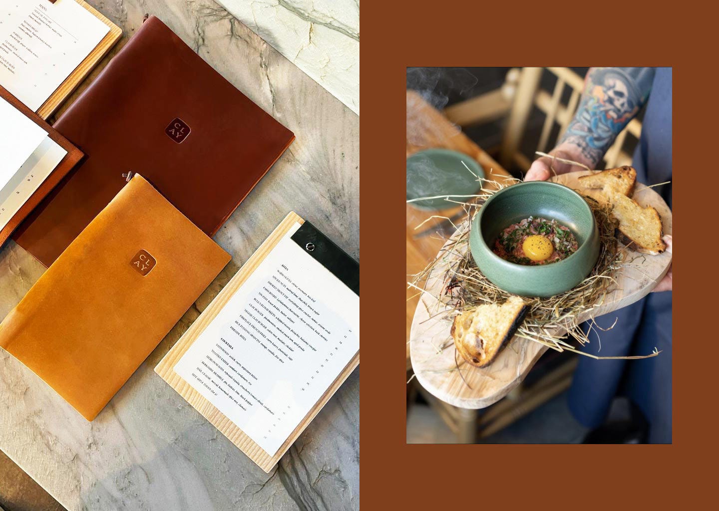
In addition to all the work carried out and mentioned above, we also undertook the branding of the restaurant that operates within the premises of Wildflower Farms. Completely in line with the values of the parent brand, Clay is a first-class restaurant with a rustic new American menu pairs seasonal vegetables grown from local farms and onsite in Clay’s rich soils.
Not just graphic design.
Another pleasant experience was starting the design stage alongside the architecture and interior design team. In a project of such magnitude, we were just a small part. Working together helped us understand how our pieces would function immersed in the hotel's context - textures, colors, and shapes were essential. We appreciate and are grateful for having had that collaboration.
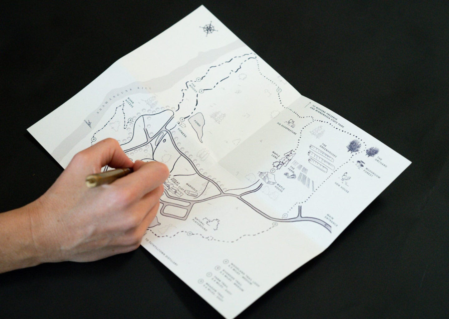
We also participated in the decision-making process regarding the materials of the pieces we designed and their production process. From the papers to the assembly of original signage pieces and connections with the suppliers and builders involved. Each piece was designed and meticulously followed through every stage, from sketch to screen and production.
Values
Last but not least, having a Big Idea or a brand core is not always enough. But in this case, we believe that the positive message that Phillip and Kristin infused into the project became very powerful. Values of respect for nature, raw materials, the real, and design. Values are shared by all the professionals who joined the project, and we ourselves share and strive to live by daily.
Other similar projects we worked on:
The Groveland
Respara
All featured projects
Thanks for reading!
See you next time
Juan & Martina