When I was a kid, my beautiful and kind grandmother used to set up her Bialetti Moka maker, (AKA Volturno in Argentina) at least twice a day all summer long during our shared vacations. Since then coffee’s smell meant summer, card games, beach, grandpas…. happiness. I’ll never forget that specific smell that l loved even though I hated how coffee tasted, the whole house was immersed in it. Somehow, 20 years later I managed to keep her Volturno and can't help myself, neither want to, to teleport to those summer feelings every time I use it. Love you Aba.
Coffee it’s not really coffee. Design knows it.
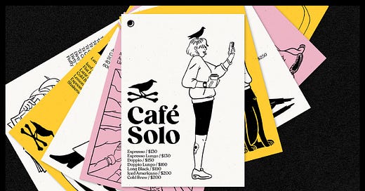
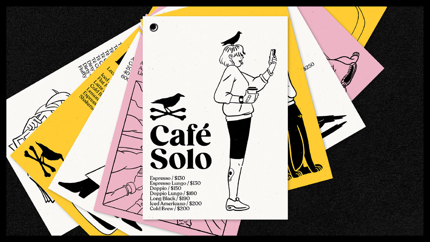
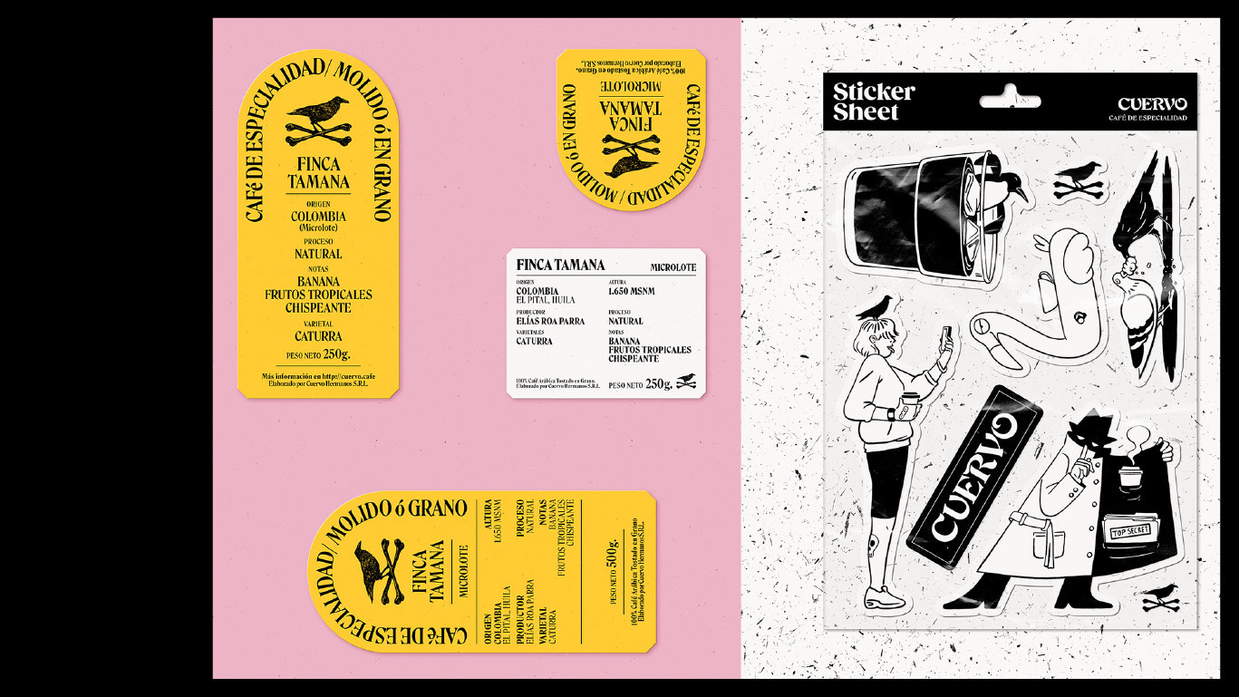
What’s all the fuzz around it? Just like almost every food we love, the ritual of making the coffee became, rapidly over the last few years, a fundamental part of the experience. In this crazy busy world, we live in, taking time to make a good cup of coffee with no rush it’s such a victory. Of course not all of us weigh beans but we all certainly improved the way we make and consume it. The objects around it became desirable (and overpriced). Nespresso machines are now a common piece of furniture, Almost anybody knows about Bodum French press, and coffee shops, roasters, or however you wanna call them became a thing, identities were created, and coffee beyond coffee. Just like the kitchen in every home, it’s a meeting point, a coffee serves as an excuse for millions of people to come together every day.
As the coffee ecosystem evolved, so has design and branding around it.
Buenos Aires coffee is a very big deal, it's part of the culture. For the past couple of years, coffee roasters and specialty coffee shops have grown quite a bit in BA and we are so excited about that.
Two of our favorite spots (and brandings) in Buenos Aires:
Oss Kafee is one of our favorite coffee shops in Buenos Aires. A very small place with ridiculously delicious coffee. The place is run by a coffee nerd and was a secret for a long time It’s a must-visit place when you are in BA.
Specht designs customised pieces for espresso machines in Australia. The Instagram account is so dreamy ✨
Pasta
All Argentinians are really Italians, at the bottom of our souls at least we are. The way we eat pasta is proof enough of that statement.
Are you feeling sad? eat a bowl of pasta. You don’t have much time to cook? Throw some noodles into boiling water. Your kids don’t eat many vegetables? Give them some spinach ravioli and they will. Pasta is the queen of food and a caress to the soul. If you don’t know who Alison Roman is, our advice is you start with this delicious Shallot Pasta that you would love, I promise.
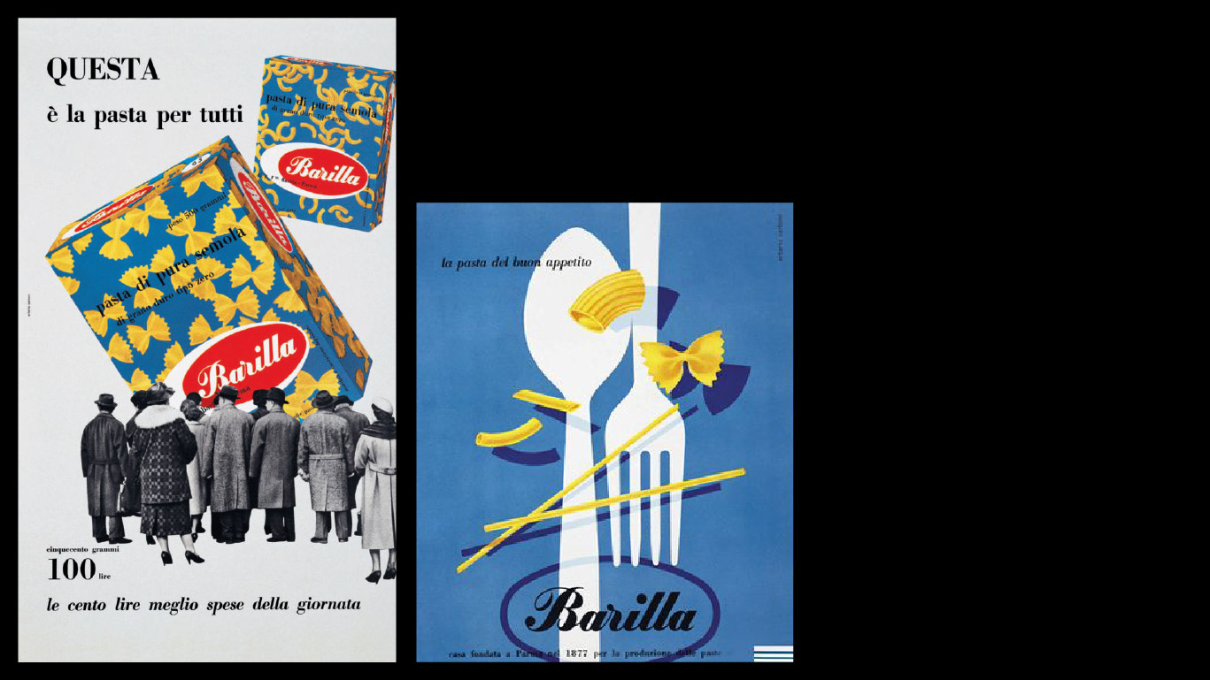
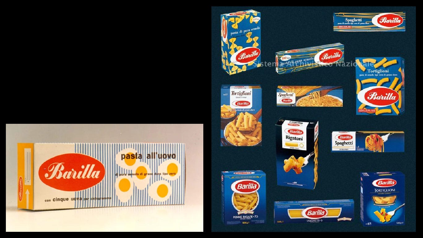
One of our favorite pasta brands is Barilla, of course. In 1877, Pietro Barilla opened a bread and pasta shop in Parma. A few years later, in 1910 the company opened its first pasta factory equipped with a "continuous baking" oven. By 1960, it was mandatory to pack pasta in a box, instead of selling it in bulk.
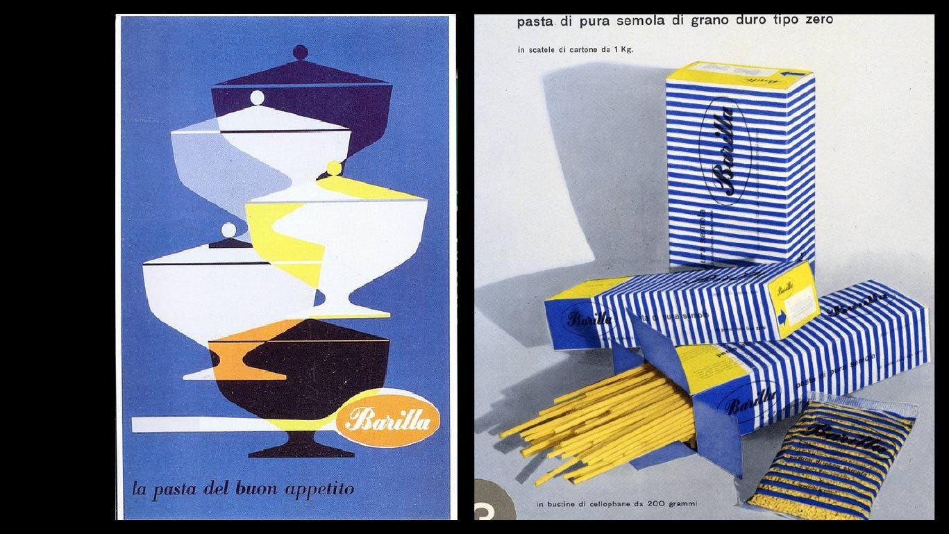
Barilla began its design journey, taking things to a new level. Erberto Carboni was in charge of the packaging design. He had already created some beautiful posters in the late 50s. For the packaging, he experimented with some simple shapes and colors, keeping the spirit of the former packaging. The blue was still part of the brand identity.
He added the open window for customers to see the product that they kept until today. Later on, Carboni also did some work on the logo. The red circle mutated into an abstract representation of an egg, the main ingredient of pasta at that time.
It's so interesting how the Barilla branding has evolved in a very subtle way until today. We can still see the color palette, the red and the egg in the logo, the window that Carboni created almost 50 years ago.
I wish we had more designers playing around with shapes and compositions as Carboni did with Barilla back in the days.
Magnolia Bakery's new Brand Strategy
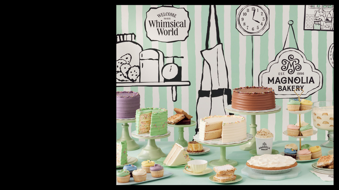
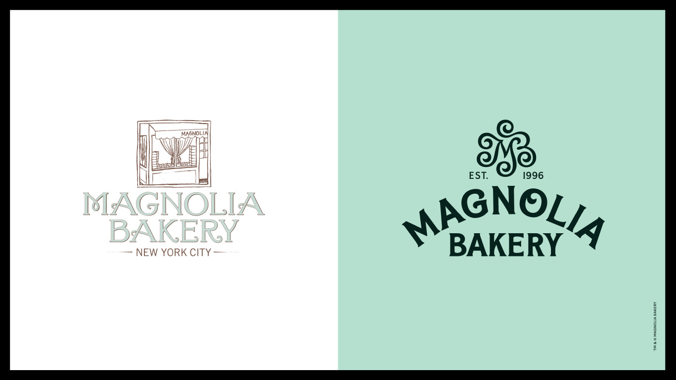
was in the search of a more inclusive and expansive Bakery, reaching the entire country not just for NYC neighbors and visitors. That Strategy translated into a new Visual identity. As you might know, the food industry brand design can be tricky. It can make your customers hungrier, or go somewhere else. In this case, a long-lasting reputation of a world-known bakery such as Magnolia Bakery was in the line. If you think this is an overstatement ask Tropicana. (Check out our epic fails in the blog).
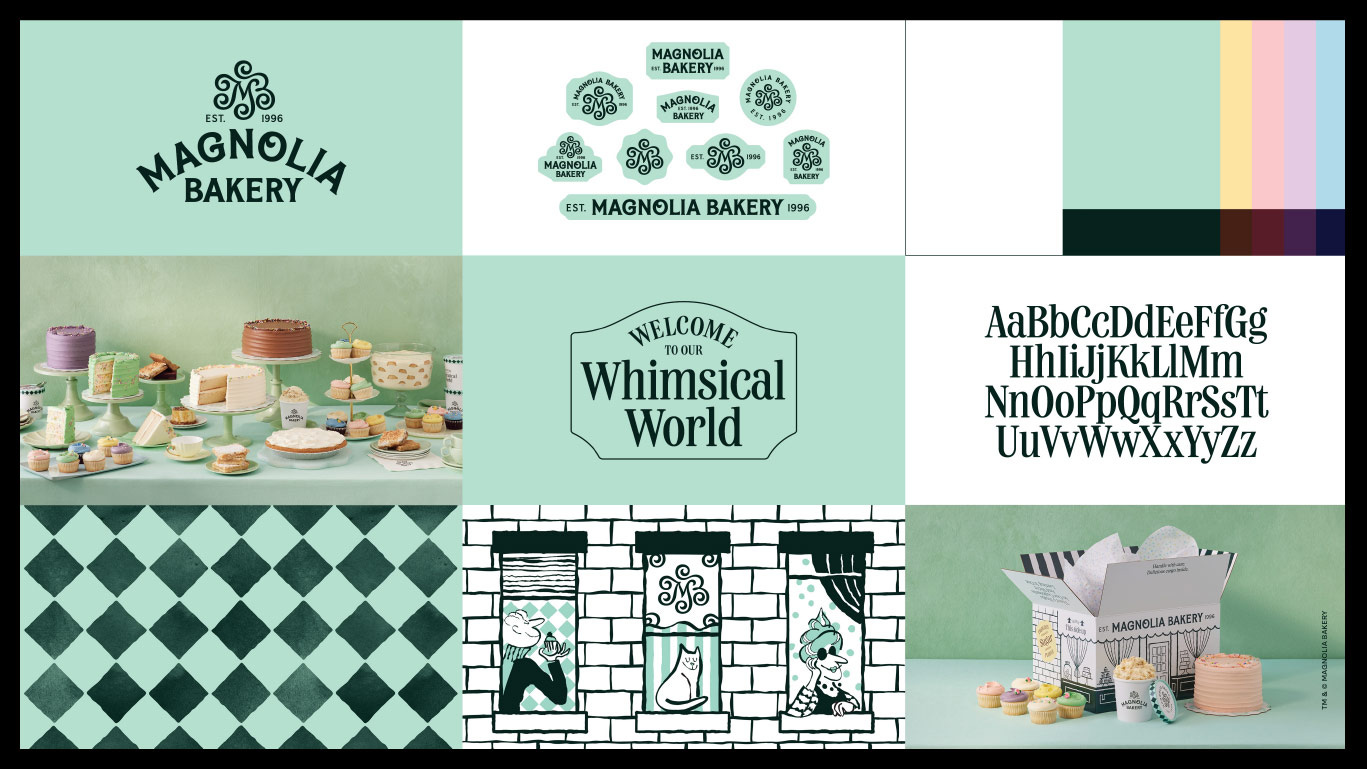
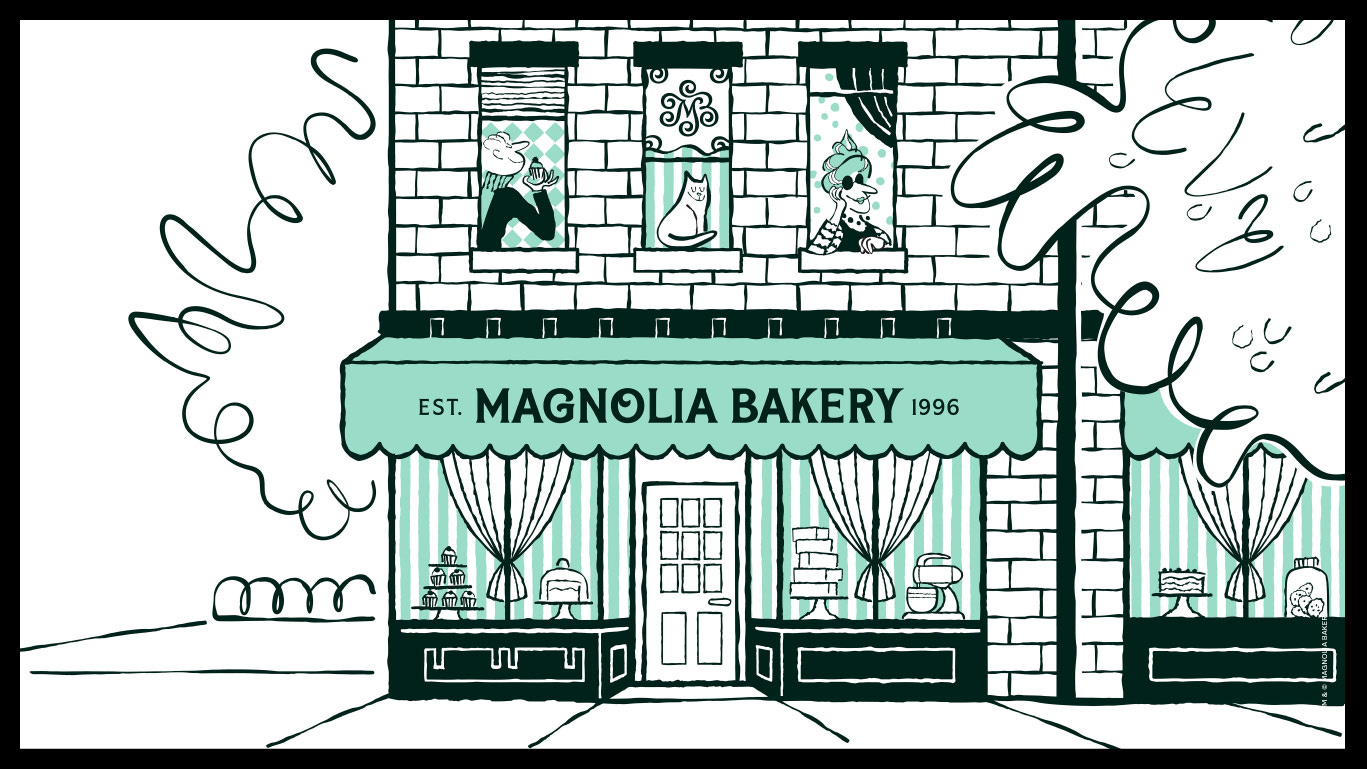
Anyway, in this case, JKR hit the spot and did a great job with this redesign. Magnolia Bakery played a significant role in the boom in popularity of cupcakes in the 90s, which has endured pretty much ever since. The trademark cupcake swirl that takes so many hours to perfect, becomes a part of the type and the icon. The famous green of the walls is now the main color in the color palette. All that Bakery next door vibe is still there but in a 2022 way. We truly see the brand spirit represented in the new brand design. It makes me forget how the old brand looked.
“We have created an identity that delivers on the brand’s deliciously indulgent in-bakery experience with a joyful and eclectic kit of parts inspired by our design strategy—a bite of whimsical delight,” said JB Hartford, Group Creative Director at JKR, in the same press release.
As MB became more than just a neighborhood store, it needed a clearer branding and a unified experience wherever the business lives, whether it’s online ordering, delivery, or even inside the bakery itself. And Magnolia Bakery has done just that.
Thanks for reading!
See you next time
Juan & Martina

