Whether we know our destination or not we are unsure of our route, we hesitate and that makes us walk slower than people among us. That aside, and the fact that we carry a big camera on our neck, we are locals, there’s no doubt about it, or at least we fancy that idea for a while. That’s how we approach cities, we don’t look after mainstream, popular, tourist guide greatest hits. We go on the hunt for the vernacular, details, the real deal, and feel. Sure, we will reach a biased and generalized conclusion and probably think people from Berlin are nice just because the seven of them we came across said please and thank you, or we will strongly claim food in Barcelona is terrible because the one and only tortilla we had was dry. Over-generalized and superficial ideas serve as the perfect and only source of inspiration to answer the question "Would we live here?"
5 cities we would live in + a design detail from each.
Ampelmann. Berlin.
Art, history, design, architecture, and above all character, are just some of the many faces Berlin has to offer, it’s boundless. The very first time we visited (way back in 2008) a project that caught our eye was the Ampelmann; AKA the stop & walk icon guy. In 1961, the traffic psychologist Karl Peglau submitted his suggestions in Berlin for new traffic light symbols including very specific ones for pedestrians.
As a psychologist, Karl Peglau knew the importance of the emotional effect and gave his little men a pug nose, a hat, and the beginning of a paunch. After all, we are most likely to trust someone we like or even resemble.
Ampelmann’s design has some interesting aspects. It is robust and it has a hat, two elements that make it more friendly but also give more space for light to pass through which helps gain visibility and therefore accessibility, unlike the conventional symbol. The gestures of the Ampelmann have a communicative purpose, the STOP sign has open arms which work as a barrier, while the GO is in motion, indicating progress.
“They were original – and will hopefully remain – figures of the street, psychologically thought out symbols of the rules of behavior for pedestrians in street traffic.”
The Ampelmann is so much more than just a practical item; it is nostalgia, a design icon and object, a symbol of the city, turned into merchandising and souvenirs. Well played Berlin, we promise never again to use the word souvenir and design in the same paragraph.
Calatrava.Valencia
The Turia River used to cross the city of Valencia, Spain, until 1957 when it overflowed causing huge damage. Consequently, its course was diverted and transformed into one of the largest parks in the country. This design decision completely changed the city. The 11 kilometers park serves as a bicycle and electric scooter highway as thousands commute every day while runners, yoga classes, and open gym routines take place. Just like NYC Central Park, it is becoming part of the city's DNA. Fun fact, Valencian people still say: "el Río" (“the river”) referring to the park, just as people from Buenos Aires still say Av. Canning to Av. Scalabrini Ortiz.
Within this park, there is an even more ambitious project. The City of Arts and Sciences takes up almost 2 km of the park and was designed by the renowned architect Santiago Calatrava (also known for The Oculus in NYC, el Puente de la Mujer in Buenos Aires, Ponte della Costituzione in Venecia, and many many more). It features six large cultural spaces open to the public, in futuristic architectural environments that display the architect's seal: the Hemisfèric, the Museu de les Ciències, the Umbracle, the Oceanogràfic, the Palau de Les Arts Reina Sofía, and the Ágora.
The unique experience of walking through these structures is breathtaking, pictures won’t make justice. Each point of view is new and interesting. Every perspective means the discovery of texture, details, and patterns. It never gets old.
HighLine Park. New York City
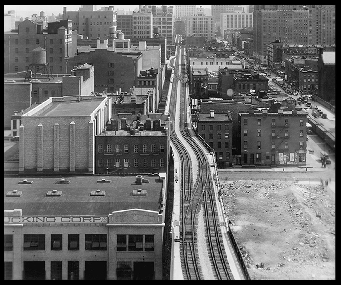
Not long ago an abandoned elevated rail line was destined for demolition. After decades of disuse, a thriving garden of wild plants took control of the structure and many people were calling the High Line an ugly eyesore. Luckily after 720 ideas from over 36 countries looking for ways the park might be used the District facilitated the use of the High Line as a public park. You can now walk through gardens, view art, experience a performance, and eat some delicious food enjoying a unique perspective of New York City.
Simple and brilliant ideas often sound obvious, but only once they are executed, we feel this is a perfect example of it.
Last but not least, let's speak about its signage and branding. Pentagram is the world's largest independent design consultancy and has designed almost every NYC mayor project. They were in charge of this particular one and with a very simple and representational icon in perfect harmony with the straight, clean lines that trace a train track and the Highline H. They say a good icon is the one you can describe to a friend on the phone, this is certainly the case.
“The designers created a simple, unique and highly recognizable identity for the group that subsequently became the logo for the park itself”
They also designed the signage, amazing. It follows the path of the railings, maintains its industrial spirit, and like every brilliant signage it's invisible when we don't need it, and it's there when we do. Lighted at night, with braille for increased accessibility. Just great.
Centrale. Milano
Milan hits you in the face, don’t worry it won't hurt, its artistic and architectural imprint will inevitably strike you as it is ever-present. Every corner, building has something to offer, it is impossible to escape from its historic value and of course elegance and fashion. You will probably feel underdressed.
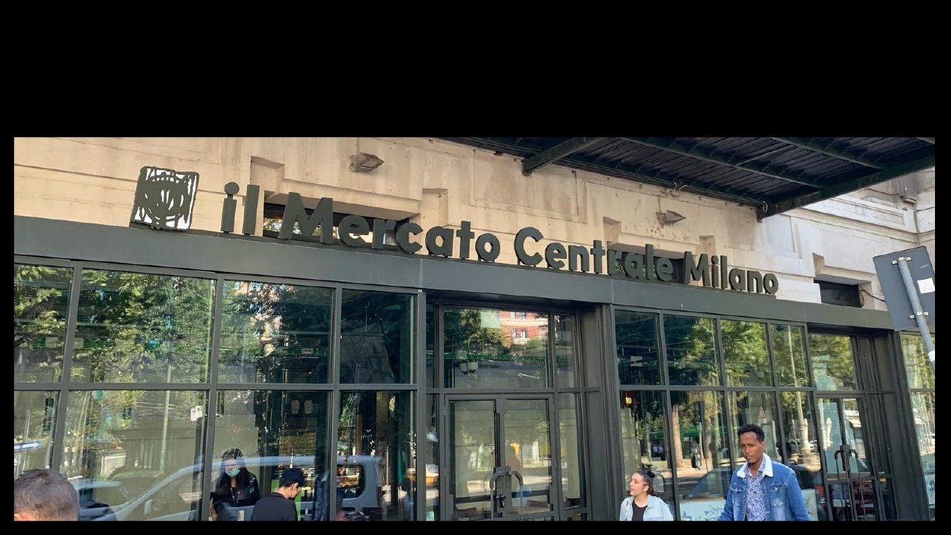
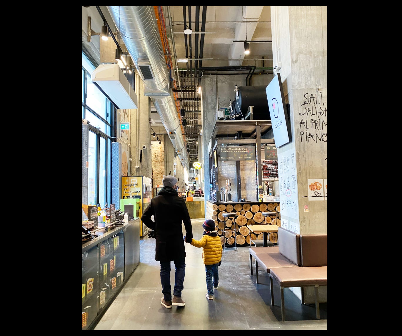
The Mercato Centrale is next to the train station (Milano Centrale), its gastronomic proposal includes Coffee, Chocolate, Meat, delicatessen, the things we like to buy the most, in a very cool venue. Its Visual Identity and system design also caught our attention. It has its own voice. Has nothing to do with the spirit of Milan but nevertheless, in that clash there is such a great richness.
Normal. Gerona
Gerona or Girona is one of the most beautiful medieval cities we have ever visited. It still preserves part of its wall, which you can explore and gives you a spectacular view of the whole city.
The old part of the city is the perfect combination of everything you imagine of a small European town: tiny cobblestoned streets where cars can hardly go through, sidewalks where not even two people fit, shops that exclusively sell local cheeses (amazing by the way), ancient cathedrals, bookstores, and our biggest weakness - and unfinished business (to visit when we return without children) - incredible restaurants with Michelin stars and lots of other alternatives not as pricey but equally impressive and newfangled. Well executed visual identities and equally well-cared-for interiors, trendy materials in harmony with their context and history. A banner of this spirit that echoes so much in us and reminds us of the famous Eames quote: "The best for the most for the least" is embodied by a restaurant called NORMAL.
Led by the Roca brothers, who flaunt 3 Michelin stars, offers a simplified approach to pretentious cuisine in order to bring people closer to a restaurant that can be visited once a week. The venue is obviously flawless.
Go to Gerona, we will certainly return. See you there.
Plus. Country / City brands
Almost every country in the world has its brand an icon, a visual identity design sometimes brilliantly executed and sometimes not so brilliantly. In the last decades, some cities jumped into the creation of their own brand. These are our favorites.
Thanks for reading!
See you next time
Juan & Martina


