#10 Web Design
March 15, 2022
Everyone needs a website
A strange idea may strike you one day as you wake up, you won’t find a rational explanation for it. A sensation, a growing feeling will take over you and a peculiar voice in your head will say: YOU NEED A WEBSITE.
These symptoms are usually experienced right after an encounter with another website, competitors, or a close friend. On another occasion, it’s just because of the inherent website's magic, the power of transforming ideas into reality. Four dropout friends in a garage suddenly can be a promising startup. All thanks to a website….amazing. Everyone needs one.
Websites don't really work at all
Some websites sell products, others collect data, and some new ones - due to COVID - help millions learn pretty cool stuff through courses, like how to make millions building, you guessed it, courses. Nevertheless, there are many ugly and useless websites with no clear goals - we hate those - BUT there are a small group of INTENTIONALLY USELESS websites and those are the ones we LOVE the most and would like to share with you.
PATATAP
Each key you press generates a sound and visual effect.
PAPERTOILET
Virtual toilet paper
ONE FISH
Procrastigame
CAT BOUNCE
Yes, really, bouncing cats
MONDRIANANDME
Make your own Mondrian
Hi there, could you please design a website for me that solves all my problems, no idea which are they.
We hate writing code
Not true, we never really knew how to do it in the first place.
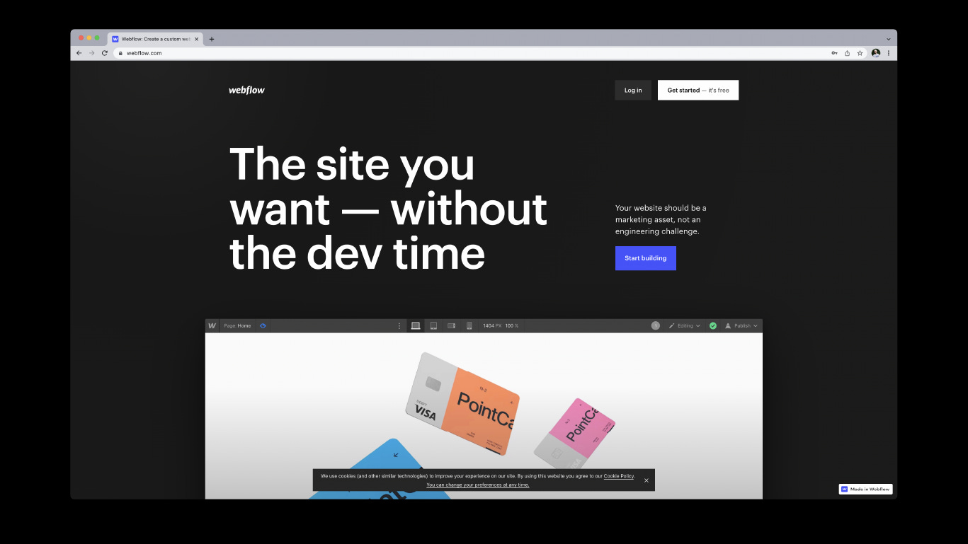
Thanks to design evolution, technology, and the universe itself 31 years after the very first website saw screen light, designers can now design and build any website without writing a single line of code.
To be fair No-Code tools emerged years ago, but almost each and every one of them was kind of a disappointment, bad code export, design constraints, and slow platforms. Webflow changed all that.
You can read more in this very interesting blog post.
We think so you don't have to
“Design is not just what it looks like and feels like. Design is how it works.” Steve Jobs.
You got that right Steve.
I still remember when I bought my first iPod. You couldn't buy one in Argentina, so my very good friend Frisco brought me one from the States. Used to the Sony products I had been using, I was expecting a medium size box, accessories, instructions, etc. None of that, an intuitive product does not need instructions. Let's raise our glasses toasting and wishing for a world with websites as intuitive as iPods, where designers think so users don't have to.
Thanks for reading!
See you next time
Juan & Martina


