The thing we are all tired of talking about and at the same time it’s almost impossible to avoid, COVID-19. Coronavirus goes through design or the other way around. The New Yorker gives us the best covers on Coronavirus week after week.
The magazine took it upon itself to build its identity around the design of its covers, art as the most eloquent and honest expression.
Here are some of our favorites. They upset us, they made us angry, we enjoyed them and now we share them with you.
Each cover and artist has a story worth reading.
Coronavirus goes through design or the other way around.
In the past few weeks, millions of Americans have been told to close their businesses, avoid public gatherings, and stay at home. In New York, especially, the lockdown has brought into relief how life in the city—in any city, really—relies on an array of essential workers, who have continued to clock in during the coronavirus pandemic and who are seldom acknowledged for their contributions. In his latest cover, Pascal Campion nods to one such worker, and to his place in a silenced metropolis.
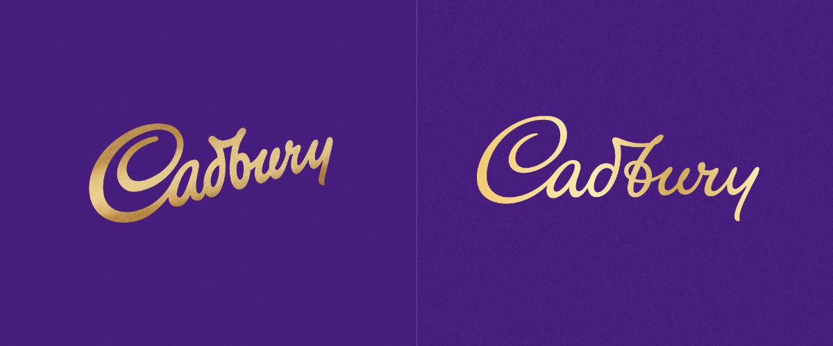
Cadbury or Cadbwy
Cadbury has just launched the redesign of its historic logo, by Bulletproof, based in London.
The controversy (there always is), revolved around two things:
On one hand, the legibility. Some read "Cadbwy" instead of "Cadbury", but does it really matter? For such an exposed and recognizable brand, is it critical that it can be read properly?
On the other hand, there was some talk about the redesign cost, which hovered around £1 Million. That seems like a lot of money to people, for a seemingly minor change, or that not much was actually changed. But in reality, they are changing the most important touch point of a brand (because they also did the redesign of the packaging) that is worth billions of dollars. Isn't it worth paying good money for this work?
The revitalisation of the Cadbury wordmark drew inspiration from the hand of founder John Cadbury himself, to create a beautifully crafted signature with a more contemporary feel.
The issue (?) of the 2020 Olympics logo
For the first time in history, the Olympics have been postponed. Tokyo 2020 will be in 2021.
NBC to the rescue! It was the first network to show a new image for the Olympics, using the claim
"Same dream. Different Year"
Masterclass in information design
Recent studies show that only one of the thousands of people who receive this Newsletter reads the print version of the newspaper, and it is not the NY Times. However, we can't help but admire the information design on the paper's front page during the Coronavirus crisis.
"U.S. job losses are so staggering that ‘The New York Times’ needed more space to show just how bad things are."
Opportuncrisis? Opportunists?
It is a critical moment in the history of mankind. It is also a key moment for brands. How to communicate, what to say, what tone to use, and a thousand, etc. more.
Do we give them the right to act fast and help raise awareness? Or do we start digging a little bit to know if they are really collaborating or just saying they are collaborating?..... Let's look at skeptical logos and analyze just that.
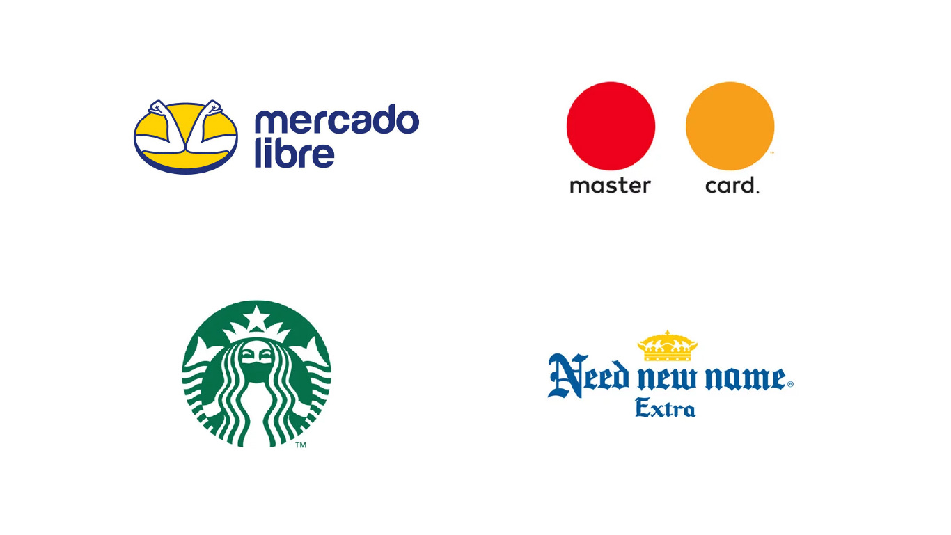
Many brands have jumped on the bandwagon of modifying their logos to raise awareness about social distancing. With seriousness or more humor, they all achieve the goal of not going unnoticed at this moment in history.
"All brands have a voice and a very big responsibility because they are part of people's lives and have a place. If they can make an impact with a positive message or an action message, that's their responsibility. They have a voice and they have to use it". Gastón Bigio, founder of Gut.


