The way of riding the NY subway (and around the world) has changed. The classic and iconic map known by everyone was redesigned, now traveling in the Big Apple promises to be easier. Great excuse to talk about maps and their design.
The most important maps of the modern era are not maps.
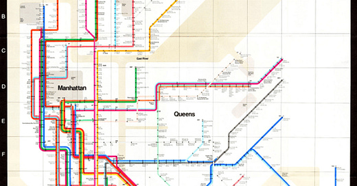
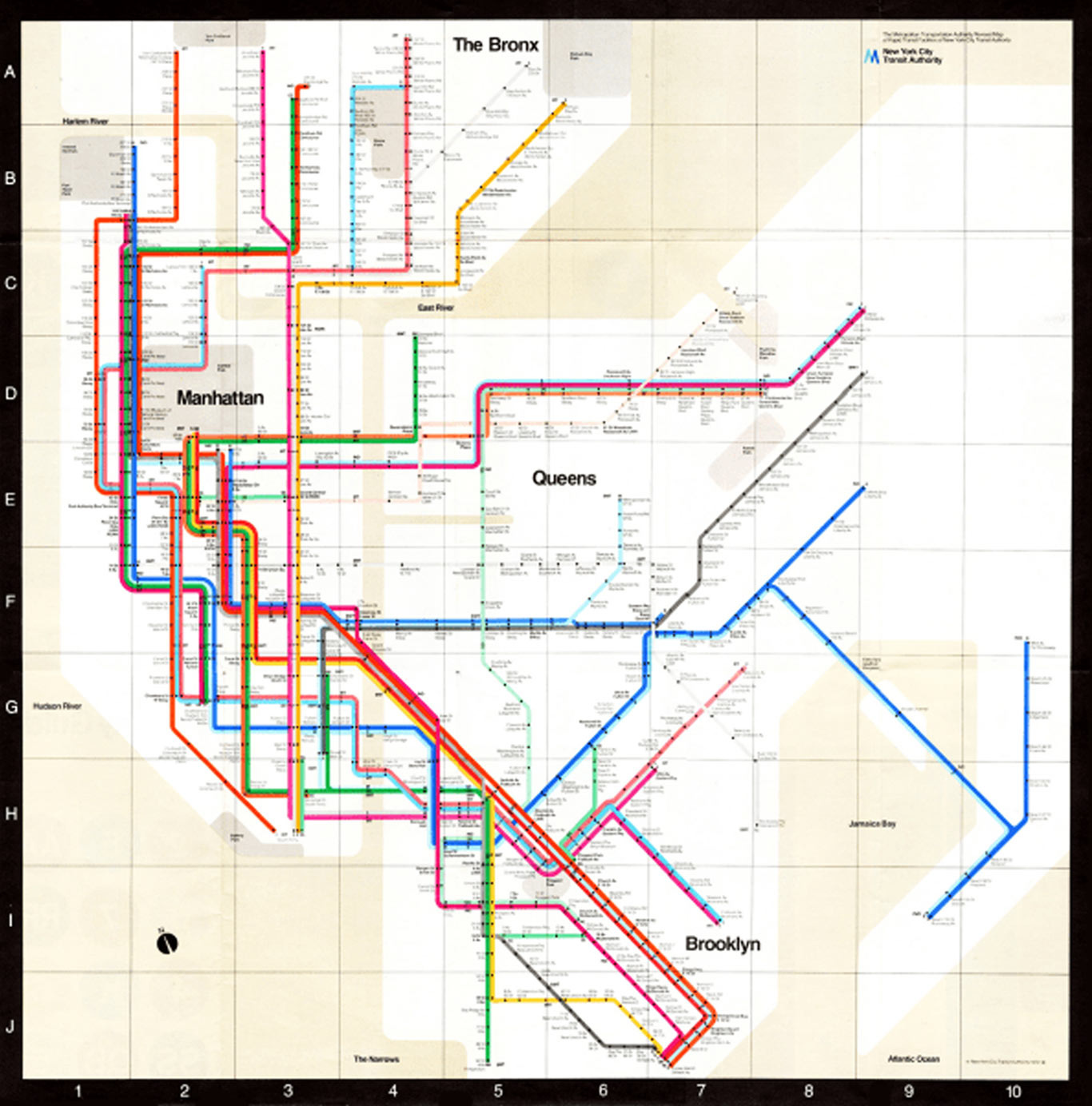
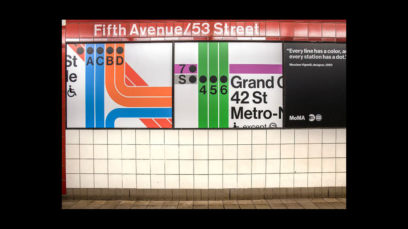
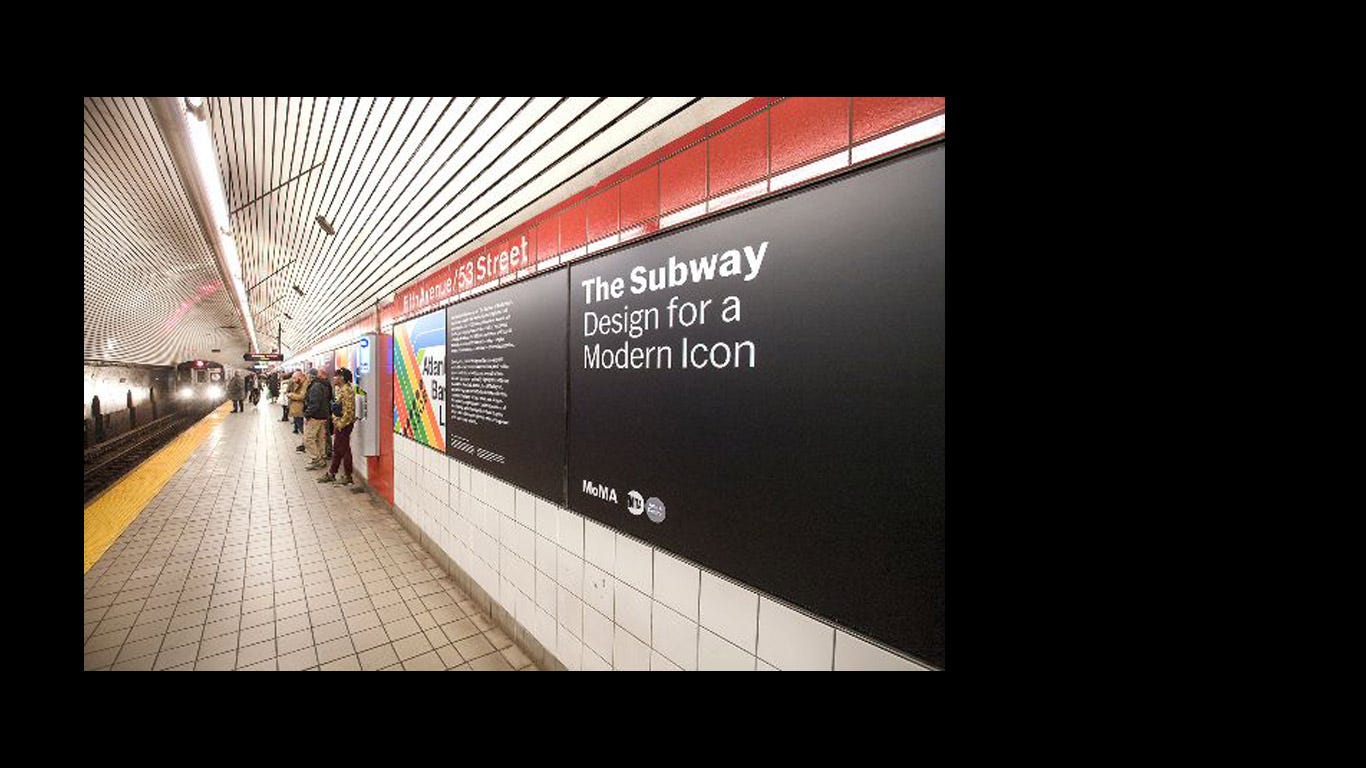
Maps and blueprints are fundamental tools to understand our environment. One day they stopped being geographic depictions to become something else. They went from being geographic to being ruled by geometry, they became diagrams, and designs. An exhibition at MoMA is currently dedicated to the greatest exponent or culprit, depending on how you look at it, of the designer and legend Massimo Vignelli.
Geometry vs geography.
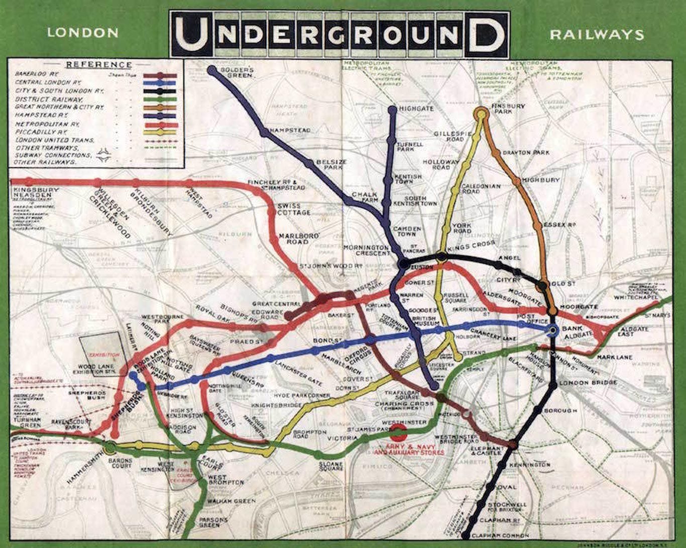
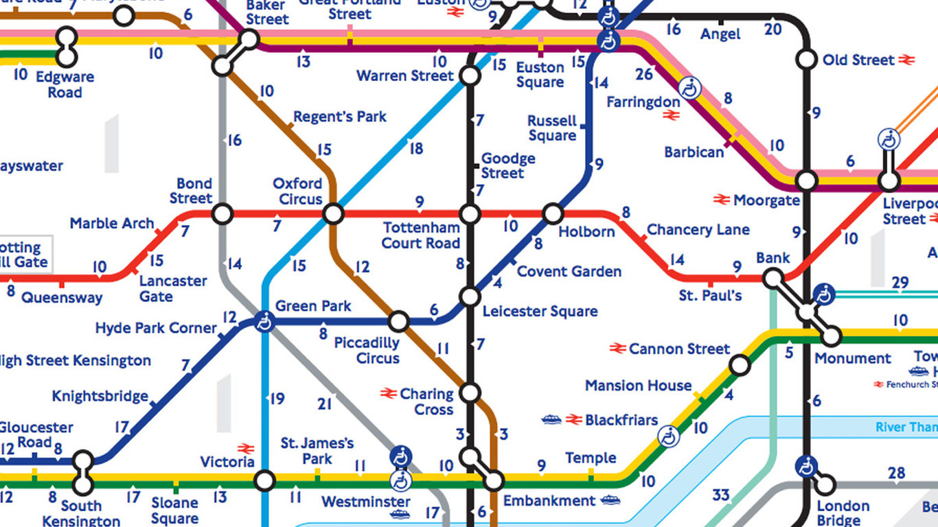
The real depiction of the city's geography vs a minimalist rendering to make the information more clear where the geography was sometimes altered.
“Of course, I know the park is green and not gray,” Mr. Vignelli said in an interview with The New York Times in 2006. “Who cares? You want to go from Point A to Point B, period. The only thing you are interested in is the spaghetti.”
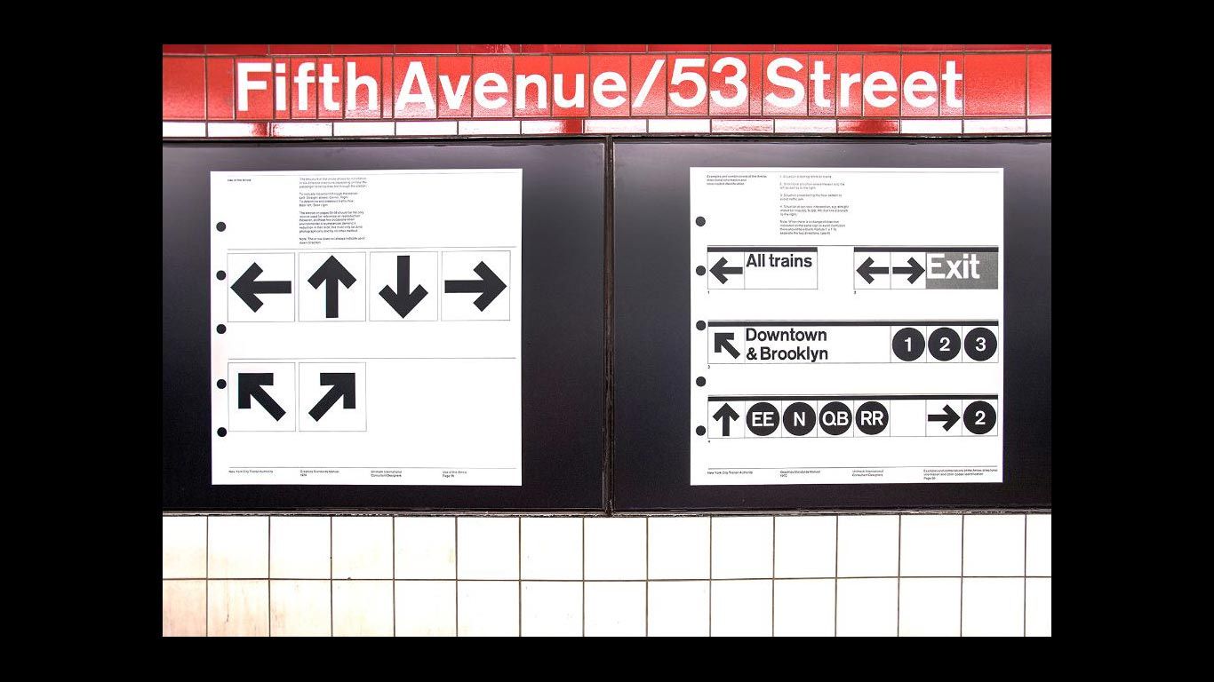
For a while, three different construction companies were working on the subway system, and each of them had its own layout of trains and stations. These three layouts coexisted for some time until in 1972, Massimo Vignelli designed the current layout with the aim of unifying the system.
What changed?
Design attempts, among many other things, to clarify communication. Undoubtedly, redesigning one of the most complex and extensive subway system map is a major design challenge.
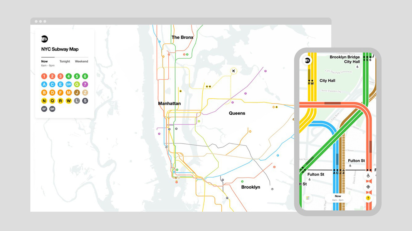
The map and signage of the NYC subway system became an app that features live updates on the status of trains when the next train will arrive, schedules, delays, and much other important information. But above all, it settles the debate between geography and geometry of the 60s.
Geography: More information and less clarity vs. Geometry: More clarity and less information.
In this new project, as we zoom in, the map becomes more detailed, and more information is displayed, and when we zoom out, the map is simplified, resembling Massimo's design.
"The Map" is a documentary by Gary Hustwit (Helvetica, Rams, Objectified, Workplace) and Work & Co, the design agency behind the live map.
Let's end with the beginning. 112 years ago this whole mess started.
In 1908 the London subway network expanded and became more complex. Many stations, connections, and a true subway system. The map they had until then, geographical, showed streets, parks, the whole layout of the city, and over it, the complex subway system. Impossible to read or understand.
Harry Beck, a 29-year-old engineer, had an idea. Leaving aside the geographical aspect, the map became a diagram, with 3 types of lines; horizontal, vertical, and diagonal at 45 degrees and with equal distance between each station.
Thanks for reading!
See you next time
Juan & Martina

